Final Cut from Jake Clements on Vimeo.
Tuesday, 30 March 2010
Sunday, 28 March 2010
Digipak Final Product
This is our final version of our digipak.
Rear View:

Front View:

Unfolded View:

Front Page:

Back Page:

Inside Page:

CD holder page:

Digipak Disc Page
For our final page we would have to create space for the disc to go. We decided that we could use a picture that gave the owner of the digipak a first person view of the microphone. We felt this would be a nice conclusion to the digipak as it would once again keep up the theme of the performance of the band being most important amongst the digipak. When the CD is removed the image of the microphone would go hand in hand with the fact some people may want to sing along with the lyrics and this image would encourage this.

Digipak Inside Page
For our inside page we decided to focus on having a picture of our lead singer. The lead singer of most bands is considered the front man for the band, the one that receives most media attention. Once again we looked through the several photo's that Tom took and found a great picture of our lead singer giving a great pose to the crowd. We chose to use the picture for the inside picture as the image would once again give the impression to the consumer that the band are renown for their live performances which can be seen in the video, front cover and back page of the digipak.

Digipak Back Page
Our plans for the back page of the digipak was always to have a picture of the band. In every filming session Tom was always on hand with his camera taking excellent pictures and for our back page we would yet again use one of these pictures.
 The immediate response we got from our original back page was that the layout and background were very good. Once again the picture had been edited to black and white with a red tint. We instantly noticed that the font that read 'Foo Fighters' had to be changed to match the font on the front apart from that we were pleased with our back page.
We changed our font to match the front cover and also decided to move the copyright agreement into a more corner based position as it looked out of place in our original effort.
Digipak Front Cover
We did originally have the idea of using a motorway at night as our front cover background, however after looking at the pictures that Tom took during filming we saw that we had good enough pictures to edit them into potential front covers. Going through the pictures we saw that we had a great side angle picture and there was enough room to put in a guitar which would really help put across what genre the music on this album is from. Above was our first design of the digipak front cover which Tom created after got the pictures we wanted.

Going through the pictures we saw that we had a great side angle picture and there was enough room to put in a guitar which would really help put across what genre the music on this album is from. Above was our first design of the digipak front cover which Tom created after got the pictures we wanted.

After Tom created the digipak front cover we started to ask for some audience feedback and once again our classmates all liked the front cover but they felt the font was letting it down. This was the same problem on the magazine advert so we decided to use Foo Fighters actual font on this album as they had used this font on some of their previous album. After changing the font to what Foo Fighters have used the front cover looked more realistic and more like something you would expect to see on the shelves in HMV. However I discovered it wasn't only Foo Fighters who use the same font on more than one album, another well-known band also does this. Oasis have used the same font/emblem for no less than five albums. Below you can see that there are five albums each with the Oasis emblem on them and they can be found in the corners of the cover.


Magazine Advert Construction
When turning up to a lesson early one day I saw that group member Alex had also been practicing a magazine advert. Although he maintained it was only a practice the rest of the group encouraged him that this was perhaps our best idea of a magazine advert. All that was left to do was to get some feedback from our classmates again, who were also our target audience.

The advert above kept within the continuity we chose through all three tasks which was to add a black, white and red colours to all tasks. This advert has clearly stuck to this in a very coordinated way with black being the background at the top of the page with a red coloured font. When the background was red the font colour was white which meant all three colours would stand out and still make the advert look neat. The only problem we had from our audience feedback was that they didn't like the font for the date, the digipak name at the top of the page and the name of the band underneath the digipak. However we were all pleased that our audience liked the advert as a whole and the changing the font was going to be time consuming.

To change the font problem we would have to think of the best solution to get the highest amount of marks possible. We then had an idea of using the same font used on previous Foo Fighters album would help the advert look more like real magazine adverts. Below is the font from two previous Foo Fighters album, the one on the left is from the album Foo Fighters and the one on the right has become the Foo Fighters emblem. By using the same font associated with Foo Fighters we decided to ditch the idea of having the album name of the poster as the digipak photo would be sufficient enough. All that was left to do was change the release date, and we changed it by putting an 'out now' title at the top of the page rather than on the bottom.

Practice Magazine Advert
To make our magazine advert we would use the software called Photoshop in which to construct our magazine. I started to practice making a magazine advert on Photoshop and below shows how.
 The picture above was taken to be used as the background and i feel it is a very effective background. The turned the picture black and white then changed the contrast and brightness before adding a tint of red. The black, white and red effect was used to help blend in the digipak when it is finished because across all three tasks we have added this effect.
The screenshot above shows the advert half completed with the title in position and the stores where you can purchase the album at the bottom. I have also put in a short review that you can see on many other magazine adverts. I have chosen to use Q magazine as the source of the quote as this is one of many magazines that have the audience we want to target.

This was the finished product from my practice at making an advert. I instantly feel that the digipak is what stands out most which was the idea as that is what we are advertising. I have also put in more reviews from NME and KERRANG! who, once again, both have the audience we wish to aim our product at. However after showing a few classmates we had one piece of feedback that was shared by everyone who saw it. Our audience felt that it looked more like a film advert rather than a music album advert. Although this was only a practice we now knew how to create a better advert than the one above.
Saturday, 27 March 2010
Tuesday, 23 March 2010
Practice Digipak Cover
Here is one of my practice digipak covers that i made in photoshop a while ago. I originally thought it looked quite good, however after some audience feedback I saw that the colour's i used clashed with what else we had planned for the video. However I kept the design just incase we changed our mind and wanted to use the idea. 
Current Magazine Adverts
Below are some album adverts from the magazine 'Rock Sound'. Inside the magazine was several adverts for new albums and they were all of the same genre of our band. This was a very advantageous piece of research from Jacob, who bought the magazine, as it provided us with some ideas of how to lay out our magazine in terms of fonts, layouts, advertisements, colours, etc. Here are some of the magazine adverts below.
 This first magazine advert took up a whole page in Rock Sound magazine but the genre of this advert is more gothic than what our advert will be. The font at the top looks like its written in chalk. The images on the advert include a small picture of the album but the band is in the background. This advert also contains tour dates which i don't think we will be including in our magazine advert but the idea of showing where to buy it from is something i think we should consider.
 The advert above only took up a small slice of the page but doesn't show the album or digipak in it at all. It contains the band posing for the picture. The feature I like about this advert is the release date is clear to see and so it should be as its the most important feature of any digipak advert as you are meant to be making sales, so to do this your target audience need to know when the release date is.
Out of the four magazine adverts i can see that this advert i aimed at a different audience compared to our digipak and the other three adverts on this blog. The font used is bold and plain which shows that their audience don't care about being different as the name of the band and the release date can be clearly seen along with a small image of the album in the bottom right corner.

Out of the four adverts this would be my favourite as it has a nice clear layout and the font used help to add mystery to this advert. The most clear and largest text on the advert is the name of the artist which is next to the picture of the album. Once again the release date is clear to see which is another piece of evidence of why we should include the release date in our advert. The background is black and the main lure of the advert comes from the name of the artist which is in large bold white letters. But once again the effect on the font helps to make this advert more effective in capturing the attention of any potential reader.
I feel that i magazine advert will have to lure the attention of the reader to turn them from a potential customer into a buying customer. From looking at these adverts I can see that we only need to put across the important facts of the digipak, like release date and artist. I would strongly put across to the group the importance of this as it would be pointless not to include this information.
Tuesday, 16 March 2010
Target Audience 2
As we approach the end of our editing and the construction of both our ancillary tasks we need to consider our target audience. The band Foo Fighters are an American rock band that have been seen on NME several times so it would make most sense that we look at this magazine's consumers as a target audience.
In my research into NME I found their demographics which where very useful in finding in more detail who reads there magazine. 76% of the NME readership is male with 24% being female. Although we are planning on aiming to both sexes this is an interesting statistic as this could allow us to make the advert 'more manly'. In terms of age the median age of the readership is 23 with 34% of the readership still being students. This is also useful when looking at how to make the advert look as a young readership would be more interested in something different or new rather than a typical advert.
We had planned to aim our video and digipak to a relatively young audience with the age to aim at being 14-25. We aim the video in particularly at an audience that enjoys rock music as the video shows a rock band playing. The close up and personal view of the video helps to put this message across and I feel we have to do this in our digipak and in our magazine advert.
To conclude I would say that our target audience would be 14-25 year olds with their employment status being students.
Current Ideas
At the moment we haven't sat down as a group and spoke about this specific ancillary task, although we plan to do this today. At the moment I have been thinking of some idea's for a potential magazine advert background. These include:
- our original idea for the digipak, which is a blurred background.
- an enlarged image of the digipak front cover but with a weaker gradient so that everything on it stands out.
- a different image of a guitar or other instrument
- taken from the lyrics 'a street light shining', i thought that maybe we could taken a picture of an empty street with the street lights shining down and then edit on the digipak and any other information we want on there.
Magazine Advert
At the moment we have struggled to find magazine adverts in music magazine's and newspapers. However I have found that during my research many magazines and newspapers advertise artist's tours. This could be a possible feature on our magazine advert as long as still advertise our digipak on the advert. We would obviously have to ask our teacher to see if this idea can be followed up as it would make further research into this task easier as these seem to be the adverts on print products. However I have seen digipak/album advertisements online on music download sites like iTunes and this could also be a possible idea of research.
Editing 2
Today we are very close to finishing our music video. We have about 30 second's worth of space still to fill with footage and group member Jacob seems to be the one that is going to finish editing as it is fair to say he has done several extra hours worth of work on it. If we are able to finish today it would leave us in good stead for finishing our ancillary tasks and evaluating.
New Idea for Digipak
Whilst editing we have also started planning our ideas for a digipak. We were going to follow the idea of a blurred motorway but this was time consuming and not relevant to our music video which had to be addressed so that we showed continuity throughout our project. Then group member Tom came up with the idea that we should use the instruments to illustrate the digipak, which could be done quickly and by using photoshop we could get the effects we want. Tom has already taken several pictures from our filming sessions and this has become very advantageous as we could use any good photos in our digipak as well.
Sunday, 14 March 2010
Evaluation 4: How did you use new media technologies in the construction and research, planning and evaluation stages?
 Perhaps the most valuable piece of technology I used during my media coursework is Blogger. I have used blogger to record everything i have needed to whilst I have been undertaking my coursework. Blogger has been used since the beginning of my coursework and till the very end. I have found a very useful piece of software as it allows me to keep in close contact with my group members and to also have an easy access to all my previous blogs which may contain information i needed. Blogger is a recent piece of technology that has come about due to the phenomenon which is the internet.The internet has been an integral part of my media coursework, especially when it comes to research. The internet offered me the chance to look at every music video in the world with the broadcasting website YouTube being very useful. As before, the internet is a new piece of technology which has become very important in the way we live and work. YouTube was also very useful when it came to planning as it had tutorials of how to use Final Cut and Photoshop. Without these tutorials the main task and ancillary task would have taken far longer due to me not knowing the basics of the software. Facebook is a social networking site on the internet that allowed us to gain further audience feedback for our music video to help us evaluate.
Another useful piece of technology was Final Cut as it offered us a great chance to edit it an advanced way. Final Cut is a very sophisticated piece of software that allows the user to a

variety of effects. We took advantage of this software by changing the brightness and contrast of the video so that the video looked more bould. This was just one of the many tools available from final cut. Final cut also offers the chance to see the timeline at the bottom which shows the user where their piece of footage is in comparison with the time on the song. I feel that Final Cut was a great piece of software and that it defiantly helped when constructing our music video. iMovie is another piece of editing software that i used when i was evaluating as i have access to it at home. I also used iMovie to convert our music video into a movie file as Final Cut didn't offer us this option.

Another piece of technology that was very useful in the construction of our ancillary tasks was Photoshop. When i started first using photoshop i didn't feel it was very user friendly as it was quite complicated to work. However after tutorials and practices i managed to get the hang of it which enabled me to progress while helping our with the magazine advert and digipak. Photoshop was also useful when it came to doing research as we used it early on to see what its capabilities where. This enabled us to figure out if we could use the software and how long the tasks we take using it.
The Sony video camera we used was another very useful piece of hardware, although problems with other camera's meant only a few number of camera's could be shared amongst serveral media groups. However we were very lucky to be able to film when we did as no one else needed the camera then allowing us to have priority over it. We would record our music video using this camera and it was wireless (unlike an older version we used on our second day of filming). The camera recorded onto tapes and using a firewire we transferred the footage onto the computers at school. The video camera was a very useful tool whilst constructing our video as it offered us the chance to film a high quality music video as well as being easy to use.
Fianlly, the last piece of technology we used was the iMac. This is the computer we used throughout our whole project and it gave us access to the software above like Final Cut and Photoshop. Its speedy connection with the internet meant we could research on YouTube in high quality as well as construct our video. The iMac is a different sort of computer from your typical desktop but as i already have a mac, i managed to get used to the controls faster than anyone in my group and when they forgot what to push I would know. This meant that the group would ask me to help if i was needed so i was always involved with them
Overall the technologies I used throughout my media coursework have allowed to push for the highest of quality finish along with me learning new skills. I found that in some areas it took time to adapt to the using this new software available, but i can safely say i cam grateful that i did take advantage of the resources i had as it has helped me to produce a good product and a good piece of coursework.
Evaluation 3: What have you learned from your audience feedback?
Our audience feedback was a very advantageous tool to have as it provided us with several opinions on how we could improve all our products.
Firstly, the audience feedback on our video enabled us to change many features of the video. The way we took our audience feedback was by taking the opinions of the people watching the video. The images under this paragraph of two sheets of audience feedback i took one lunchtime. I simply asked each person who was watching the video to write down what they liked and didn't like. By getting one person at a time to watch the video it meant that their feelings toward the video would not be changed depending on what other people thought. I also made sure that the person watching the video stated whether they were a media student or not as they would be looking at different features of the video. The people we asked to watch and comment on our video were people all in the same age boundary of our target audience and they were all of the same employment status, being a student.

Our audience feedback enabled us to keep in parts of the video that our audience liked. The clips that found that our audience most liked were the bass drum shot, good camera movement and the inclusion of all band members in the video. The bass drum shot has so far developed into being our flagship shot has whenever somebody watches our video they always comment on how much they like this shot. However, although we found that are target audience really enjoyed watching this shot, it was very important that we didn't put to many shots of it in otherwise the admiration for it would be far less than if it was only shown once or twice. The camera movement was a very nice piece of feedback that i wasn't expecting to hear. We had done several hours of filming and we were standing and crouching for long periods of time as we tried to get the shots we wanted. To hear our target audience liked our direct work from filming was more of a moral boosting piece of feedback that helped morale amongst the group.
The inclusion of all band members was another piece of audience feedback felt by the majority of people that watched our video. We published the video on facebook and 3 of the comments left were in fact about 'how they liked all the band members being shown for a fair amount of time correlating with their contribution to the performance'. This was very positive feedback as it meat we had given each band member the right amount of camera time which is an integral part of editing a music video.
The audience feedback also gave us comments about the negative aspects of our rough cut music video. Each person had different opinions of what they didn't like but there weren't really any collected opinions on what people disliked. The reasons for people disliking parts of our video is that they found it too shaky in parts, shots being too long and being too close to some band members.

As we were filming handheld there was always a chance that the footage could be to shaky and we filmed the same thing several times so we had several alternatives incase the footage was to shaky. This meant that when it came to changing some of the footage, we had several alternatives to use which was a big advantage. Our audience feedback also told us that Our shots were too long in places which was also another feature of our music video that we could change without tampering with the video too much. The alter this problem we simply added for more footage where we felt the shots were to long. This did help to improve our video as this criticism, constructive as it was, led to us increasing the tempo of the video, making it better. The final piece of criticism we got from the majority is that there were shots when we were to close to the band members. This was the hardest piece of criticism to take as we didn't entirely agree with it, but if our target audience didn't like what they were seeing we had to address that issue. To do this we found alternative shots to replace some of the old shots that were deemed to be to close to the band member.
The audience feedback for our digipak and magazine advert was also very useful, but we didn't write down what our critics said because we just made the change there and then. The changes needed were only minimal has the only constructive criticism we got was that the font didn't look right and the colour of the background was also a bit dull. These changes were only small but they did offer us the chance to make our product better. Overall our audience feedback allowed us to improve the overall quality of all our products through the constructive criticism and positive feedback from our target audience.


Evaluation 2: How effective is the combination of your main product and ancillary texts?
Firstly the passion in the video was portrayed because it had to be if we were going to do the song justice. Our digipack was able to express the passion from the video due to the front cover being a picture of the band performing in the video. This photograph exerts passion through the band members playing with such focus. The lead guitarist, left of the guitar, is a prime example of what we were trying to put across to our target audience as his head was down, looking at his guitar but you can see enough of his facial expression to notice that he is really tying hard to get the best out of himself in his performance.

Our target audience is 14 to 25 year olds, which means we had to make sure that all the tasks we did, were aimed at this target audience. To do this we put effects on all three tasks that we felt would appeal to the consumer. In our video we changed the brightness and contrast and added a red tint. In our digipak the lure is the image of the guitar, which has been edited to stand out amongst a black and white background, in which it does. The effects where meant to add a sharp edge to our products which would make them stand out from other products.

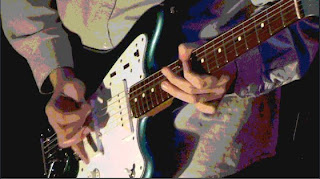
Across all three platforms there are clear signs of the genre of music. The rock genre can be seen in our work through the frequent use of the guitar. Our video shows a performance and therefore the instruments can be clearly seen, especially the guitar. The front of the digipak has a large image of our lead singers guitar, the magazine advert has been made so that the image of the guitar seen on it is yet again the focus of attention.
The fonts were also another feature that had to be kept consistent especially through the magazine advert and digipak. The font used on previous Foo Fighters albums was added after audience feedback onto the magazine advert. After short consideration we changed the font on the digipak to be the same as the font on the magazine advert as both products go hand in hand with one another and shouldn’t be clashing.

In research I found that many bands had a strong link between their video and digipaks. This research meant that we had to make sure we had a clear link between our video and digipak. The music video for many bands is seen as an advertising tool and the digipak must use the advertising power from the video to sell as many records as possible. I feel that as a group we did managed to keep all three products within the traits of the genre. The link of the performance, colour effect and guitar has helped to keep all three products similar in aesthetic value. The aim was to always keep links between all three products so the advert can be linked to the video and the video linked with the digipak.
Evaluation 1: In what ways does your media product use, develop or challenge forms and conventions of real media products?
Evaluation 1 from Jake Clements on Vimeo.
Script:
In our music video we chose to film without a tripod, leaving us with handheld shots throughout the video. The advantage we saw from filming handheld was it allowed us to move freely amongst the band and get into angles you simply can’t whilst using a tripod. In our research we saw that this was common amongst other rock videos.
Tuesday, 9 March 2010
Designs for the Digipak
At the moment we are editing our video, so it makes sense that we should start planning our ancillary task of creating a digipak. We are going to follow the idea of taking a picture of a motorway at night during rush hour with the shutter speed vastly reduced so the headlights create long lines. This is an effect we think will look very good as an album cover plus it is quick and easy for us to do.
Editing
We have decided after watching the footage we got from our fifth day of filming that we enough enough to edit and have started to do so. We have edited in all of our lessons and in our free periods. During lessons we only leave two people in charge of editing with the rest of the group checking on their progress and offering their ideas. Working in a group of four allows us to do this with the main advantage being that we can work on our ancillary tasks at the same time. So far we have edited about half of our video without transitions and effects and i am confident if we continue with this work rate we can have a rough edit for this weekend. Currently group member Jacob has taken it upon himself to edit the most which is great as the video has consistency throughout. However i feel that some of the workload isn't being passed around evenly due to group member Alex being ill for a few days during editing although i feel he will make up for this in the final weeks of our coursework.
Ineedmedia.co.uk
This is a website i found while researching our digipak. It gives us measurements we could use when creating our digipak. The link to this website is below:

Digipak Research
This is one of the digipak's that group member Tom has got and he has kindly brought it in so that we could all gather what a digipak was and look to create our own one with enough time to spare.
Wednesday, 3 March 2010
Fifth Day of Filming
Yesterday we undertook our fifth day of filming once again it was at the Red Lion Pub in Gravesend. I felt this time we were more prepared as we had the plan sheets to use so we could make sure we got the shots we wanted and i felt that we succeeded in this. With me, Tom and Jacob filming the same band as last time i felt we had got all the remaining shots we needed which only leaves the editing to do to complete our video. Although we completed filming later than i had hoped we have still got a few weeks before our deadline to get our editing and ancillary tasks complete. Here are some of the pictures Tom took during filming.

The picture above is a shot of me filming a side shot of the band playing.

This is a picture of the band performing and its the same angle where we had taken some shots on the video camera.

This is a picture of group member Jacob filming our drummer Matt for the opening sequence.

The is a picture of when we first arrived and i was telling our drummer what we wanted him to do.

This is an over shoulder shot of our drummer during filming.
Tuesday, 2 March 2010


Friday, 26 February 2010
Plans for our background
As half our group had started to edit our video footage I began thinking about photos we could take for our album cover. As i was listening to the song i heard 'I'm a one way motorway' and this is when i thought that perhaps a motorway as our background would look good. Jacob then suggested that only having one lane of the motorway would be better. This was my favourite idea for an album cover and one we could quite easily use. We will obviously have to go to a bridge to take this photo and at a late time to get the exact picture we want.
Wednesday, 24 February 2010
Fourth Day of Filming
Yesterday we filmed for the fourth time in our third location. We used the red lion pub again which offered us good lighting last time we were on set. We knew that this time we were going to film more handheld shots which we immediately did. The first to film was group member Alex who was getting up close and personal with the band. At first this seemed like a good idea as we were able to direct around the group getting the shots we wanted. However upon looking at our footage on the computers we discovered that by filming as we went along we didn't film in order of the song. We instantly had the time consuming problem of having to pull clips of our video from all over the timeline on final cut. This wasn't our biggest problem however because we had lots of footage to edit for our final video but my main concern upon seeing the footage for the first time today is that we have missed out some parts of the song and there are times where there is some back room clutter ruining the shot. Although we have these problems i feel we have enough footage to start editing and building a base for further footage to come. With only three of us in the lesson to see the footage we have all agreed that we wold have to go back this weekend to get some more footage to improve on what we already have.
Tuesday, 23 February 2010
Video Mood Board
These are some shots from live performances that i thought were pretty good and would consider using in my music video.


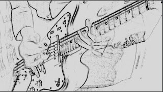
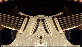
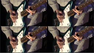
Editing Practice
The snapshots below are some shots of me practicing editing of Final Cut, the software we plan to use. These snapshots are taken from clips of our third day of filming and many of them contain effects that are available on Final Cut. Some of these shots are effects I like but won't use because they wouldn't suit our music video.
Subscribe to:
Comments (Atom)